
Clearspeed _Dashboard

Overview
Clearspeed company's internal dashboard was to keep all digital files, results, priority-based results, and filters mainly. The old dashboard was not clean or intuitive and lacked accessibility.
However, I noticed a few more pain points that lower the quality of employee experience with the product. Those are limited features (such as an inability to see analytics data in comparison to a previous period), obsolete interface design, and lack of a decent mobile version. This case study walks you through the process of fixing those limitations by redesigning one of the most important pages "Results" for the company dashboard.
I was a lead designer on this project, along with a Product Manager and V.P of clearspeed.


.png)
Problem Statement: Employees of clearspeed take twice long to find the result along with the data visualization of potential risk.
How might we help the employee to find results effectively and optimize the search option by using location or language?
Goal:
Scope of Work
-
Create a modern visual style
-
Redesign the Dashboard page
-
Improve the Navigation menu and Search bar
-
Deliver a mobile version
-
Make it accessibility friendly
Research
Determined to make the new search feature work the way employees want, we conducted four rounds of user testing with iterations based on feedback — and the product manager, VP was a part of this crucial as we conducted this testing. I did change a lot of information architecture of how things were designed before. the hierarchy led to a lot of confusion and unwanted white space.
Key Takeaways
-
The Virtualize PII doesn’t play an important role on the Dashboard page and should be removed
-
A comparison feature should be added for the main numbers on the Dashboard page (Ex: Performance of high risk and low risk. etc.)
-
Squarespace Commerce Dashboard has the most favorable design layout among competitors. It’s presented elegantly; not overloaded with features.
-
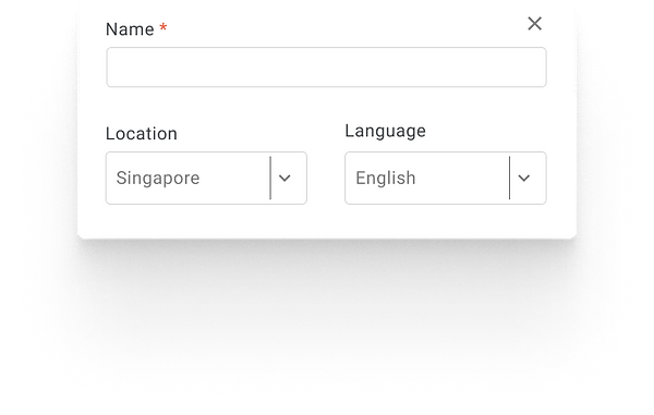
The Search Bar should somehow inform the user on what it is capable of finding by location and language etc.
-
The main navigation menu can be simplified by merging Results with Analytics
Old Version
Hierarchy was not used as the priority of usage.
This feature is not optimized well.
.png)
Layout could be better
Search option was not optimized well
Virtualize PII was not used as much as expected
Filters are not as intuitive for employee
Iterations
While working on wireframes I had a major insight regarding the Dashboard redesign — to combine the search with the results widget. Then it combines the data for both results data and will show the potential risk widget right under the search option on one common chart.
The new Dashboard represents a snapshot of new filters and the comparison of their results. Based on my research those indicators are Filters and Sub Filters, Search with Location and Language, Remove name and position, and Redundancy for IRN and name.
Iteration 1

Iteration 2

Final Designs
After a number of Iterations, we were finally able to make clean, intuitive, and visually functional designs. We were able to optimize the search option and removed number and position from the main dashboard. We also made changes to the hierarchy of the top sections. We created many useful filters and sub-filters and made them more useable.
The most drastic changes were the result widget which showed potential risks and questions which were at risk.This made the work easy, faster, and more efficient for the employees.
Old Version
.png)
Redesign Version

.png)
Prototyping and Components

I worked closely with engineers to validate the design and copy implementations. Along with daily stand-ups, we also had weekly demos and would occasionally sit together and cross-check implementation with the final design.